Case study · a research project
The Economic Report Influence Graph
A 3D map of where official numbers come from, where a line between two reports goes in only if a published document says it belongs there.
A question nobody could answer
Every important number in public life — inflation, a disability payment, how much your city gets for road repair — is calculated from some other number, which was calculated from another, back to a handful of foundational statistical releases. Almost nobody can see that structure, including the people who depend on it.
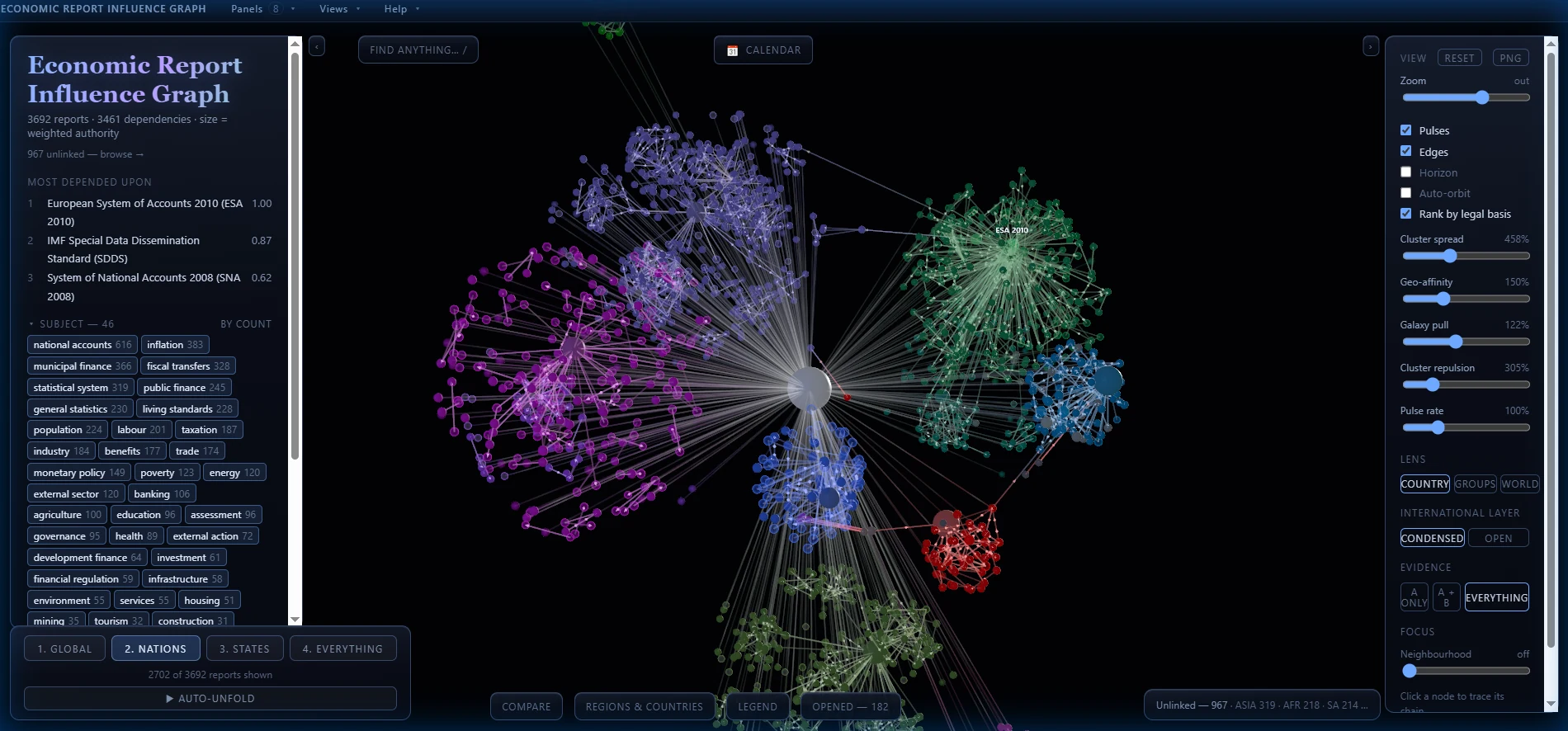
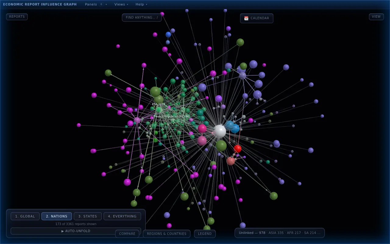
This draws it. Each sphere is a real published report, each line a documented dependency between two of them, and a report’s size is how much everything else rests on it. It runs in a browser, in 3D, with no backend.
“I made the Graph because I wanted to see how something at a municipal level is influenced by something on the international level. I also wanted to see how organizations such as the EU and BRICS operate compared to nations.”
No document, no edge
No document, no edge. A line is drawn only if a published document says, in words I can quote, that one report uses the other as an input. Leads I cannot source go to a dropped list with a reason attached. Every existing line is graded A, B or C on how well its cited document actually supports it, and the grade is visible in the app, because a map that hides its own weak spots is worse than no map.
2. **No document, no edge.** If nothing published says a dependency exists it does not go in the graph; unverifiable leads go to `_dropped` with a reason.

`npm run validate` must pass before and after any data change.
CLAUDE.md in the project’s repo, verbatim. Curated: the file has more.CLAUDE.mdThe checks that enforce it are on the Method page.
Three misses: a slider, a sentence, and the docs
-
Sliders that did nothing
The layout has sliders for its physics, such as how hard the clusters of different countries push apart. Three times, a new force shipped with a slider that did nothing. Each time the force itself was correct, and a script measured it working. But moving the slider never restarted the simulation, and by the time anyone touched it the simulation had settled, so the force was being multiplied by almost nothing.
Kind of miss: looked right but was not measured · handoff 032 -
The right quote, the wrong subject
A research session recommended a New Zealand dependency as checked and ready to add: New Zealand’s government finance statistics, built on the international System of National Accounts. The quote behind it was real and copied correctly. But the sentence was about an international manual, not New Zealand’s release. It said the manual is consistent with the System of National Accounts, not that New Zealand’s figures are built from it.
Kind of miss: plausible but invented · NZ handoff G.3 -
Documents that were true when written
Besides the handoff, which is rewritten every session, the project keeps standing documents: its rules, its playbooks and its plain-language description. The handoff was checked every session. Nothing checked the others. When they were read against the most recent handoffs, seven statements in them were false, and every one had been true when it was written.
Kind of miss: drift across sessions · doc audit, 2026-09-07
Use it, read the sentence, sweep the rest
-
I used it
The last two were caught the same way: I moved the slider, saw nothing change, and said so. The third time, my words were “I don’t see any effect from it.” The force was fine. The slider had never been wired to restart the simulation, as the working sliders were. The fix copied their wiring, and it was checked by dragging the slider in my browser.
Became the rule: “verify by dragging the slider, not by measuring the force in a script” · PLAYBOOK-RENDER.md -
The next session read the sentence, not the summary
The following session went back to the quoted sentence itself, instead of the last session’s summary of it, and checked what the sentence was about. The dependency was not added. It went on the dropped list with the reasoning. The two other New Zealand dependencies recommended with it held up, and were added.
Became the rule: “read the sentence as well as fetching it” · NZ handoff G.3 -
I asked for the documents to be checked against the record
Too many recent sessions had been about the machinery, not the research: “many recent threads have had to do with the way this all works, not the actual work on the project.” So I asked for the latest handoffs to be read against the standing documents. That read found the seven, and all seven were corrected. It is routine now: every fifth handoff sweeps the standing documents as well as itself.
The rule now: sweep everything on every fifth handoff · HANDOFF.md
| The correction | The standing rule | Enforced in |
|---|---|---|
| Three sliders shipped doing nothing, while a script said each force worked | Verify by dragging the slider, not by measuring the force in a script | PLAYBOOK-RENDER.md |
| A correctly quoted sentence was about something else | A recommendation, a premise or a summary is a hypothesis until it is checked | CLAUDE.md · rule 13 |
| Seven statements in the standing documents had gone stale unnoticed | Every fifth handoff sweeps everything, the standing documents included | HANDOFF.md |
A graph that shows its own weak spots
One city’s budget, traced all the way back
This is the slice that sits above my own city. Start at the City of Grande Prairie’s budget report, follow only what it is documented to depend on, and keep following: fifty-odd published reports and seventy-odd dependencies, ending at statistical standards written by the United Nations. The road-repair money is in there.
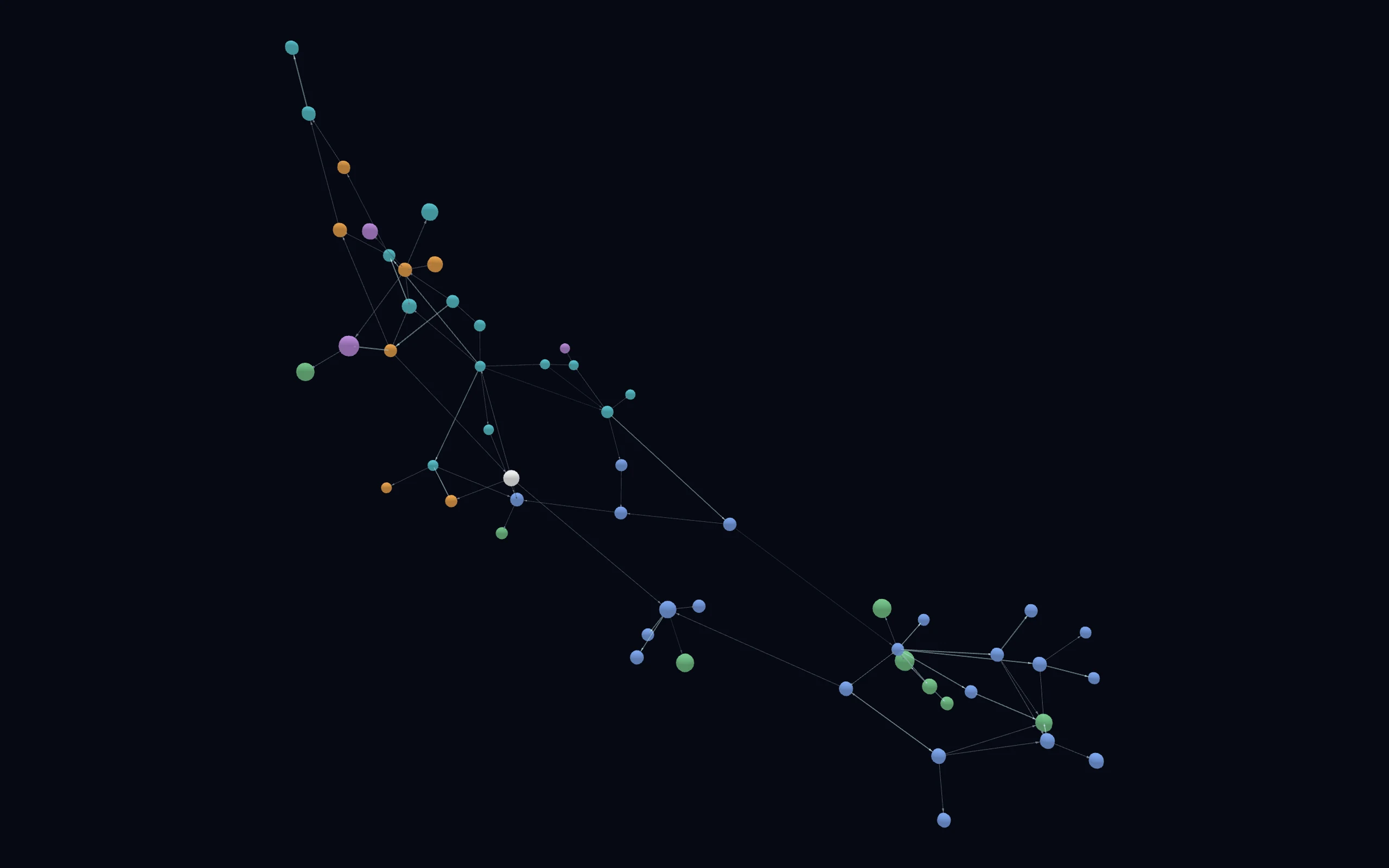
The still is a render of the same data. Nothing three-dimensional is downloaded until you ask for it.
- The budget itself
- Municipal
- Provincial
- Federal
- Institutional
- International
- Size is how much of the whole corpus rests on that report
One path through it, in words
Six documents, and every link graded on how well the document I cited actually supports it. Two of these are C’s. They stay visible, and they stay graded C, because the weak joins are the ones a reader most needs to see.
- Uses data from · graded B City Budget Report, City of Grande Prairie → Local Government Fiscal Framework — Capital Funding Allocations, Alberta Municipal Affairs
- Is calculated from · graded C Local Government Fiscal Framework → Alberta Budget — Fiscal Plan, Alberta Treasury Board and Finance
- Uses data from · graded A Alberta Budget — Fiscal Plan → Canada Health Transfer, Department of Finance Canada
- Is calculated from · graded C Canada Health Transfer → National Economic Accounts (Quarterly), Statistics Canada
- Follows the methodology of · graded B National Economic Accounts → System of National Accounts 2008, United Nations, European Commission, IMF, OECD and World Bank
The honest limits
The corpus grows. Statistical agencies publish on their own schedules, so the graph is built to keep looking — new releases get pulled in, new dependencies get sourced and graded, and the counts move every week. Any exact figure quoted here would be wrong by the time you read it, which is why you will not find one.
The live slice on this page is a snapshot from September 2026, and the full graph has moved on since. The grades also show how unevenly the map is drawn: some countries in depth, others by a single thread, which says who has looked, not what exists.START-HERE.md
The files behind every claim above
-
What the project is, in plain language, and how unevenly the map is drawn
-
The rules every agent reads before touching the project
-
Three sliders that did nothing, and the rule that came from it
-
Where that rule lives now
-
The right quote with the wrong subject, and why it was refused
-
The audit that found seven stale statements
-
The sweep, on every fifth handoff
-
All three misses in the receipts inventory, with the rest of the project’s